my years at redcloud
There are periods in a designer’s career when growth is easy to recognize. You learn a new technique, discover a new visual language, master another tool, and suddenly the work looks different. And then there are periods when almost nothing changes on the surface, yet everything underneath begins to shift.
My years at RedCloud belonged to the latter.
I did not leave that period believing I had discovered a new style, nor that I had become technically someone entirely different from the designer who had entered it. What changed was something harder to measure: my sense of scale. The canvas simply became larger, then larger again, until at some point design stopped being something contained within the borders of a screen and began occupying stages, squares, streets, LED walls, billboards, television screens, printed matter and, ultimately, the collective field of vision of thousands of people.
Working in entertainment has a peculiar way of doing this to you. It keeps moving the walls outward.
At Color Day, I found myself designing a stage stretching for more than thirty linear meters, surrounded by branded inflatables and visual elements whose dimensions belonged closer to architecture than to conventional graphic design. A composition that looked balanced on a monitor could become almost invisible once translated into meters of scaffolding, light and human movement. Typography was no longer measured only in points; it had to survive distance. Color had to compete with sunlight, smoke, crowds and stage lighting. Graphics were no longer merely seen — they inhabited space.
And once you have watched something you designed on a small screen rise above a crowd as a thirty-meter physical structure, your perception of what a graphic designer can actually influence becomes difficult to shrink again.

spring festival — the square, in your hand
Spring Festival — projectspring festival
Spring Festival pushed that idea much further.
For two weeks, Skanderbeg Square became less of a location and more of a living organism, one that changed its rhythm from morning to evening and seemed to demand new visual material almost as quickly as we could produce it. There were two stages and five different event sectors — fashion, garage sale, artisans, art and music — each with its own energy, audience and programming, yet all of them had to speak with the same visual accent.
Massive LED screens carried animations across the square while print materials, schedules, posters, social media content and countless other assets extended the identity into every possible corner of the festival. Some days the communication for tomorrow barely existed today; artists changed, performances shifted, announcements appeared, and the machinery had to keep moving.
There was something almost theatrical about the process itself: while one event was unfolding in front of the public, somewhere behind it another was already being visually assembled for the following day.
Design, under those circumstances, could not afford to be precious.
It had to breathe.
It had to stretch without breaking.
It had to remain recognizable even while changing shape.
And perhaps this was one of the most useful lessons of that period, because I began to understand that a visual identity is not truly tested when everything is controlled, but when reality begins pulling it in ten different directions and it still manages to remain itself.
from a design to a system
From a design to a system
The scale of these projects gradually reinforced something I had probably believed before but had never experienced so physically: an idea is only as powerful as its ability to survive outside the designer’s computer.
A visual language could begin as an illustration or a typographic experiment and, days later, find itself stretched across a billboard, compressed into a social-media post, animated across an enormous LED wall, printed on a brochure or translated into a television commercial.
The work travelled.
And every time it travelled successfully from one medium to another, it strengthened my confidence — not because confidence had been missing, but because there is a difference between believing that your ideas can work and watching them repeatedly survive contact with the real world.

This was also what made RedCloud such an unusually satisfying creative environment for me. I was rarely confined to the final stages of execution. I could move through almost the entire creative chain, from the first vague thought to the object eventually placed in front of the public; from A to Z, from imagining the visual world to building the individual pieces that would allow that world to exist.
Illustration could collide with typography. Branding could become motion. Motion could become architecture. A poster could become a stage, and a stage could become the visual memory of an event.
The borders between disciplines became increasingly porous, and I liked living inside that ambiguity.
a creative ping-pong
A creative ping-pong
Some of the most important lessons, however, did not come from the projects themselves but from the people around the table.
Working with RedCloud founder Klodian Makashi, intensely creative and instinctive, sometimes almost recklessly willing to push an idea further, and with the company’s CEO at the time, Uarda Koçi, whose approach was more measured, structured and corporate, often felt like watching two different gravitational forces acting on the same object.
Somewhere between them sat the work.
Ideas moved back and forth like a strange game of ping-pong — one person seeing possibility where another saw excess, one responding emotionally to something another approached strategically, one wanting to push further while another asked whether pushing further actually served the project.
At first glance these positions can appear contradictory. Over time, however, I began to see them as evidence of something far more useful: people do not experience the same image in the same way.
Taste is not mathematics.
There is rarely a single invisible line separating the correct design from the incorrect one. People carry different references, histories, instincts and sensitivities into the same room, and therefore the same image can excite one person, leave another indifferent and make a third uncomfortable.
Instead of weakening my convictions as a designer, understanding this made them stronger, because it allowed me to separate conviction from certainty.
You can believe deeply in an idea without pretending it is the only possible answer.
controlled chaos
Designing inside controlled chaos
Of all the projects from those years, three remain particularly vivid in my memory, partly because of their creative possibilities and partly because of the sheer volume of material they demanded.
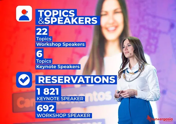
Syn+Ergasia was a three-day fair that contained much more than the word fair suggests: parallel events, speakers, dedicated discussions and different thematic programs, all unfolding inside the same ecosystem and generating an enormous family of communication materials.

The challenge was not creating one beautiful image.
It was creating an image capable of having children.
And grandchildren.
A visual system had to reproduce itself across dozens of applications without slowly dissolving into visual noise, remaining flexible enough to accommodate new information while rigid enough to still feel like part of the same world.
Spring Festival amplified that challenge through duration and speed. Two weeks of programming meant two weeks of constant visual metabolism. The identity was never finished because the event itself was never still; it was being performed, modified and communicated simultaneously.
There was no luxury of waiting for the perfect moment.


Sometimes the train was already moving and we were laying the tracks several meters ahead of it.
Strangely, I loved that rhythm.
Because somewhere inside the pressure, the deadlines and the constant production, there was an exhilarating sense that design was not decorating an event from the outside — it was participating in its pulse.
And then came Alpha Show.
alpha
Alpha
Alpha began as a proposal.

alpha show — one world, every screen
Alpha Show — projectalpha
At the time, Noizy was preparing a major concert and several creative directions were being explored for what its visual world could become. RedCloud gave me the freedom to propose my own interpretation, and when that proposal was selected, what initially existed as a possibility suddenly became something much larger.
I created the Alpha logo and began constructing the identity around it: aggressive neon reds, darkness, illustration, typography and a visual tension influenced in part by the electric dystopian atmosphere of Akira. I wanted the communication to feel less like advertising for a concert and more like fragments from the universe in which that concert existed.


The identity eventually became more than the image of a single event.
Through Alpha I came into direct contact with Noizy and Ermir Gjylameti, with whom the collaboration continued through later editions, and the visual language born from that first proposal left traces in the way Alpha would continue to present itself.
There is something deeply satisfying about seeing a design survive the moment for which it was created.
Most commercial work has an expiration date. The campaign ends, the posters disappear, the LED screens go dark, the stage is dismantled and the city quietly covers yesterday’s communication with tomorrow’s.
But occasionally an idea leaves a footprint.
Alpha was one of those projects for me.
read cutting the alpha mark →the bigger the madness
The bigger the madness
When I look back at RedCloud now, I do not remember that period merely as a sequence of festivals, campaigns and designs. I remember it as the place where the dimensions of my imagination were recalibrated.
The creative freedom I was given allowed me to test ideas without constantly reducing them to what seemed safe, familiar or immediately practical. I could draw, distort typography, build identities, animate them, enlarge them until they occupied buildings and stages, and then watch those same ideas return to the tiny rectangle of a phone screen without losing their DNA.
That freedom created a particular kind of comfort — not the comfort of repetition, but the comfort of knowing that an ambitious idea does not have to frighten you simply because it is large.

scale as an invitation, not an obstacle
the bigger the madness
Somewhere during those years, scale stopped feeling like an obstacle.
It became an invitation.
And perhaps that is the most permanent thing I carried with me from entertainment: the suspicion that when an idea feels slightly too ambitious, slightly too loud, slightly too difficult or even slightly absurd, it may not be a reason to make it smaller.
Sometimes it is a reason to push it further.
Because in entertainment, where attention is fought for beneath lights, music, crowds and an endless avalanche of images, modesty is not always a virtue.
Sometimes the bigger the ambition, the greater the madness — and the greater the madness, the more alive the work becomes.